News September 16, 2022
Ein Prost! Official Munich Oktoberfest Unveils New Logo
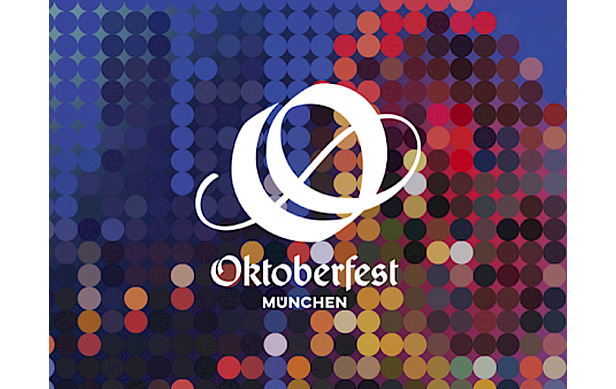
Designers created a special font for the logo: a stylized “O” that combines elements of the traditional and modern for a look that aims to be classic, contemporary and immediately recognizable.
Beer! Beer! Beer!
And now that we have your attention: The world’s most famous beer festival, the official Oktoberfest held in Munich, Germany, begins Saturday, Sept. 17, and runs through Oct. 3. It’s the first Munich Oktoberfest since the COVID-19 pandemic began. For sure, that’s reason enough to don a dirndl or lederhosen and hoist a stein in jubilation.

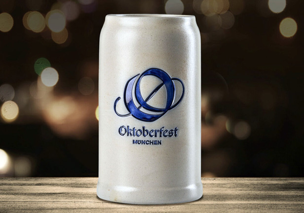
The new Oktoberfest logo featured on a beer mug.
But for design and marketing lovers, there’s another compelling reason to check out the suds-soaked celebration: The 212-year-old festival has an all-new standalone single-symbol logo – a fact some say is a first.
Developed by Germany-based brand agency RED, the logo is a stylized “O” that combines elements of the traditional and modern for a look that aims to be classic, contemporary and immediately recognizable.
For the “O,” RED created a new font, called “Wiesn,” a local nickname for Oktoberfest. The font is based on a Fraktur typeface that designers say recalls Oktoberfest’s founding in 1810, but has an updated contemporary typeface that’s cosmopolitan and international, providing a great foundation for long-term worldwide brand-building. The script shape of the “O” reflects the “swing and spirt” of Oktoberfest, organizers said.

RED, a Germany-based brand agency, developed the new logo. Find more information and imagery here.
“As an agency, we asked ourselves the question: ‘Which symbol is the right one that can stand for Oktoberfest?’” shared Michael Mazanec, managing/creative director at Red. “We came to the conclusion that the Oktoberfest is so colorful and multi-layered that no single pictorial sign could do justice to these different facets – be it the beer mug, the heart or the Ferris wheel. Rather, it should be abstract, open to interpretation and atmospheric. The initial ‘O’ of the word ‘Oktoberfest’ meets all these requirements.”
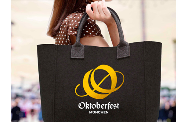
The new logo now appears virtually everywhere, from tote bags and beer mugs to physical signs and digital advertisements promoting the festival.

The new Oktoberfest logo appears on products that include totes. Find more information and imagery here.
“The logo with the stylized letter ‘O’ is the central symbol for the festival’s new image,” said Clemens Baumgärtner, head of labor and economic affairs at the City of Munich.
Oktoberfest celebrations around the world can trace their roots to the one in Bavaria. In October 1810, the first Oktoberfest was held to celebrate the marriage of Crown Prince Ludwig to Therese of Saxe-Hildburghausen. The event has gone on to become the world’s biggest Volkfest, which is a combination of a beer/wine festival with a funfair that typically occurs in Germanic countries.
Even if you can’t make it to Munich, give a toast or two to Therese and Ludwig, and enjoy the creativity that went into the new logo. Zum Wohl!
