Strategy October 22, 2018
How to Prepare Artwork for DTG Printing
With tweaks, colors become more vibrant and comparable to screen printing.
Preparing artwork for direct-to-garment printing requires a different approach than working with screen printing. Here are a few considerations when you’re working with images for DTG. Though these instructions are written for shops using Adobe Photoshop, many of the methods outlined can be done in other raster graphic programs like Corel Photo Paint.
Learn the limitations. DTG machines print using the standard cyan, magenta, yellow and black (CMYK). When you convert a great-looking digital file from RGB to CMYK, many colors go “out of gamut,” meaning they can’t be reproduced exactly using just CMYK. DTG colors can be duller – especially spot colors – than a typical screen print. If the customer is used to seeing a bright scarlet screen print on a white shirt and you then do the same job with DTG, the red won’t be as vibrant. Your job is to compensate for this loss and try to overcome it with tweaks.

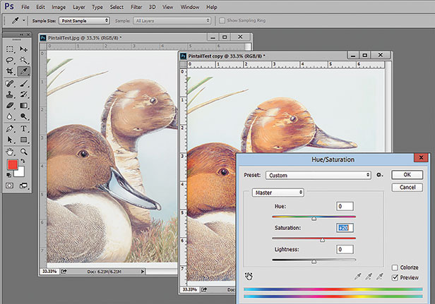
Increasing saturation by 10 to 20 points will make the colors on a DTG image pop.
Choose the right file type. Even though you often get JPG images with a white background, what you really need is a PNG file with a transparent background. Just as with screen printing, you can’t make a proper underbase when the file has white (or a shirt color) around the image. Learn how to remove backgrounds so there’s transparency around the image. Most raster image processor (RIP) software for DTG has features to “knock out” the background. There’s also a lot of inexpensive third-party software that can do this.
Adjust your image resolution. You often get low-resolution 72 dpi images that are small in physical size. The first thing to do is go to Image/Image Size and upsample the image to 200 to 300 dpi and make it the correct physical size. This minor improvement will eliminate “jaggies” and smooth the edges.
Improve low-quality JPG images. If the image was a low-quality JPG file, you might see “artifacts” and “blocks.” Unlike screen printing where such imperfections might show up in the final print, these problem areas may not be as noticeable on a DTG image. If your file is a low-quality JPG image, you can use off-the-shelf JPG enhancement programs (very inexpensive) to improve the image and remove artifacts and boxes.
Improve your color saturation. This is a biggie. The conversion from RGB to CMYK reduces color saturation, and when bringing images from a vector program like Corel or Adobe Illustrator into Photoshop, there can be a color shift and dulling of the colors. Go to Image/Adjustments/Hue Saturation and move the Saturation slider up about 10 to 20 points. Don’t overdo it – just get the colors to pop a little.
You can also help an image by using the Tone Curve to improve contrast. I like to use what I call an S Curve. It darkens the shadows and lightens the highlights and can make a huge difference in a flat image. Go to Image/Adjustments/Curves.
Sharpen the image. Photoshop has a great Sharpening filter that can enhance/improve the edges of the image when used correctly. Go to Filter/Sharpen/Unsharp Mask (don’t let the name fool you) and start with a setting of Radius 1.0, Threshold 6.0 and Amount 250. Then move the Amount slider up or down. Make sure Preview is checked to see the effect, but always go back and forth so you can see the change to the image.
Fix black and white areas. What appears to be solid black or solid white on the monitor is often not so. Open the Info Panel (Window/Info) and stick it somewhere so you’ll never close it. I use this panel all the time – it reads density levels. Select the eyedropper tool (this panel works with most tools) and place the tool over areas you think are dead black. Dead black is 0 levels of RGB. Any reading other than 0 means you won’t have dead black in that area. You will end up with a dark gray. Do the same for white areas. Dead white is 255 levels of RGB. Any other reading means your RIP will try to put a small amount of color there. You can adjust these areas using Tone Curve.
Scott Fresener has been in the industry since 1970 and is the co-author of How To Print T-shirts For Fun And Profit. A popular speaker at trade shows, he runs the website www.T-BizNetwork.com. Reach him at scott@tbiznetwork.com.
