Product Hub November 16, 2020
How to Stand Out with Fall Colors
Pantone’s favorite hues for the season offer creative possibilities.
Get ready to introduce your clients to a whole new color spectrum, from scorching red to magenta purple to acidic yellow-green. “Offering a rich narrative, the palette for Fall 2020 highlights our desire for versatile, timeless hues,” says Leatrice Eiseman, executive director of the Pantone Color Institute. Whether your client wants function or fashion, these 14 shades will give them something that’s wearable far beyond the fall/winter season.
Stand Out in Neutrals
This season’s core hues are great for making singular color statements and also provide a foundation for creating opulent color combinations.
• Earthy Sandstone recalls nature walks and sandy beaches: This neutral embraces Pantone’s “less is more” philosophy for the season. An easy color to pair with more saturated tones or other neutrals, Sandstone flatters all skin tones.
• Say hello to Rose Tan, the grown-up version of Millennial Pink. This dusky shade adds a touch of color and composure.
• Pantone calls warm Peach Nougat “nurturing” and “inviting,” a bright, creamy shade that inspires happiness.
• Almond Oil is a smooth, subtle and sophisticated off-white that’s a go-to color, especially for athleisure and streetwear styles.
• Pantone’s Sleet is a “timeless gray that’s dependable, solid and everlasting.” Basically, this is the medium gray that goes with everything.
Selling Strategy: Streetwear, a category that’s blown up thanks to influencers and Gen Zers, is more popular than ever. Neutrals like Sandstone and Sleet work for head-to-toe looks in tracksuits and coordinated hoodies and joggers. Sustainability is also huge, and neutrals speak to an undyed feel. Almond Oil echoes a natural vibe, communicating that growing push toward eco-friendliness. Shades like Rose Tan and Peach Nougat offer a brightness that’s perfect for sororities.
Turn Up the Heat With Hot Hues
Reds and oranges communicate effervescence, authority, enthusiasm and confidence. This season’s power colors offer something a little different:
• Amberglow is the perfect “notice me” shade to pair with a warm neutral like Sandstone or Almond Oil. For clients who want to exude self-confidence and creativity, this is their shade.
• A full-bodied red, Samba is pulsing with “an upbeat energy,” according to Pantone. This hue adds a warm, energetic vibe to any outfit.
• The perfect meld of red and oxblood, Fired Brick is strong and adds gravitas for industries that want to inspire trust in their customers.
• Red’s playful cousin, Pantone’s Magenta Purple, is “hypnotic and mesmerizing.” Consider it a hipper version of prior seasons’ lilac shades.
Selling Strategy: Amberglow and Samba offer customers a vibrant backdrop that’s especially great for black-and-white graphics -- customers will send a message and get attention with these colors.
Build Confidence in Blues & Greens
Cool blues and greens come in multiple shades of brightness, saturation and richness, so there’s a color for everyone:
• For brands that describe themselves as “optimistically rebellious,” Green Sheen is the perfectly bold, acidic shade that stands out, and not in a cheeky way.
• A deep cooling blue-green, Ultramarine Green “exudes self-assurance.” Think of this shade as a more subdued version of emerald.
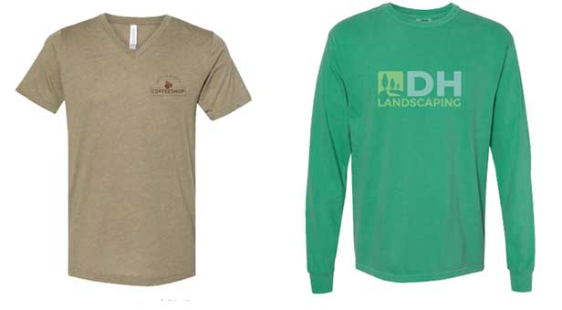
• The most neutral of all this season’s greens, Military Olive is a strong foundational tone that communicates strength, stability and power.

(From left) This Bella + Canvas tri-blend (3415), from S&S Activewear (asi/84358), is a good example of Pantone’s Military Olive; Try this Comfort Colors garment-dyed heavyweight tee from S&S Activewear to latch onto the Ultramarine Green trend.
• Classic Blue is the farthest thing from singing the blues. In fact, Pantone says this boundless hue is “evocative of the vast and infinite evening sky” and opens us up to “a world of possibilities.”
• The royal-meets-navy Blue Depths creates an air of mystery. Designers are featuring these deeper tones more often, in place of the electric blues used in past seasons.
Selling Strategy: Green Sheen and Ultramarine Green will work perfectly for brands or virtual events associated with health, wellness or fitness. Think gyms, nutritional companies, and tech firms. Grounded shades like Military Olive, Classic Blue and Blue Depths appeal to all ages and work well for use in corporate collections and company store offerings. Pitch white logos so designs will get noticed on these deeper tones.
James Andres is the content manager for S&S Activewear. Contact: jandres@ssactivewear.com.

Product Hub
Find the latest in quality products, must-know trends and fresh ideas for upcoming end-buyer campaigns.
