Strategy May 04, 2017
An Easy Cure for Ailing Color Separations
The softened edges Adobe Photoshop creates when it converts vectors to rasters is the disease of the graphics world, but there’s a simple solution.
This is a topic I’ve written about many times before, and it’s dear to my heart since I’m in the trenches every day doing color separations in Photoshop. Even though a good portion of the separations are built in a vector program like Adobe Illustrator or Corel, I get the job of separating because of the complexity of the image or if there is a placed or imported JPG image along with the vector artwork.
The problem I’m addressing here is one a normal vector artist wouldn’t realize is an issue, but it’s the disease of the graphics world for color separators: the dreaded Anti-Aliasing that Photoshop uses to soften edges of images when it converts them from vectors to rasters.
Why anti-aliasing? Honestly, I think it’s somewhat leftover from slower computers and lower resolution graphics. It’s Photoshop’s way of helping to soften jagged edges and smooth them. That was a HUGE deal years ago with lower-resolution graphics. Now, with fast computers and graphics that are at least 300 dpi, it’s almost a nonissue.
When you build an image in a vector program, it’s made up of the “math” between point A and point B. There is no image resolution at this point – other than if you place or import a raster image (you know, the one you borrowed from a Google Image search). We’re NOT talking about that type of image here.
When you save your vector image as a PDF or EPS in Corel or Illustrator, the vector data is still math. But when you open it in Photoshop, the math is converted to pixels, and one of the questions you get is whether you want Anti-Aliasing turned on.
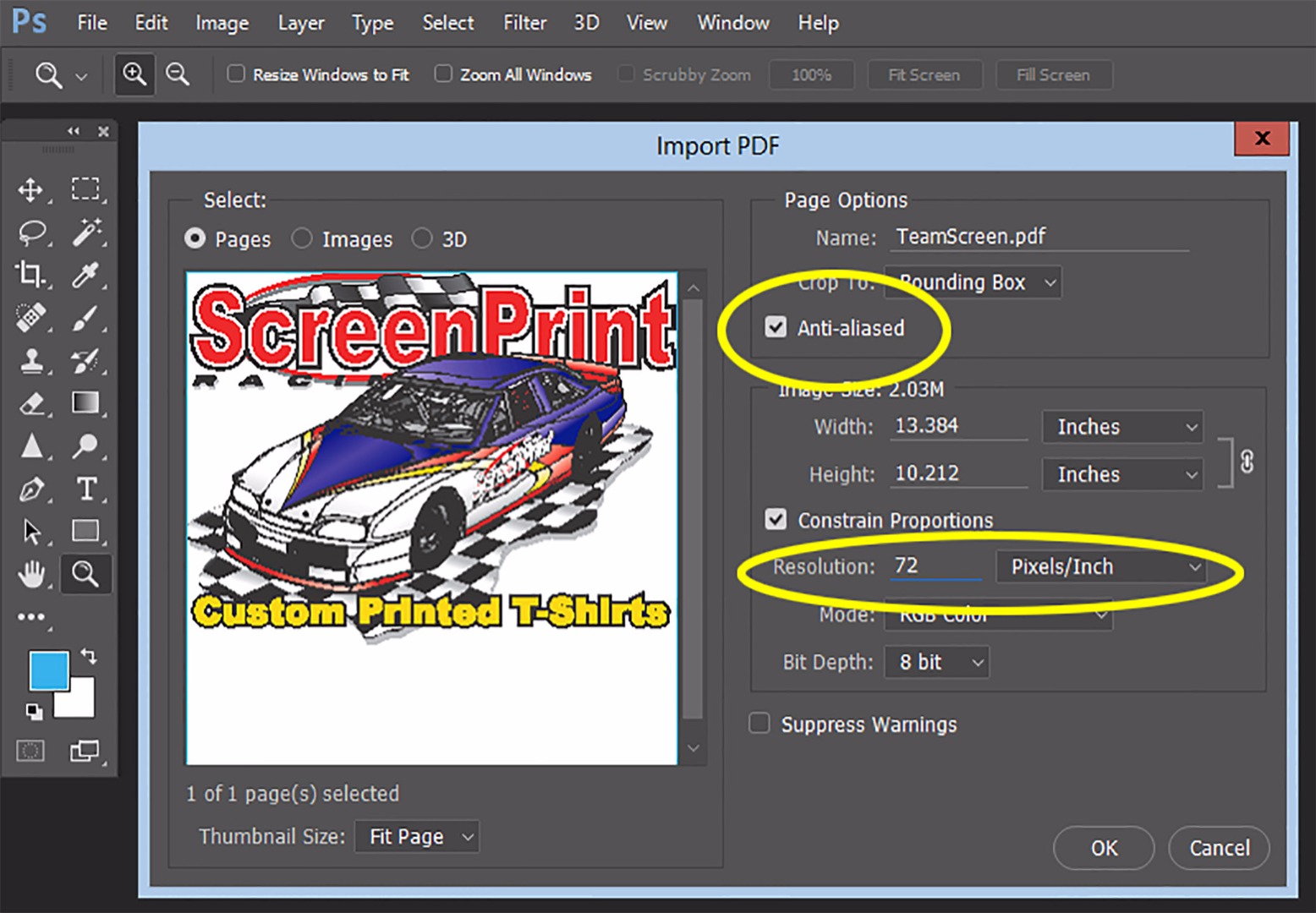
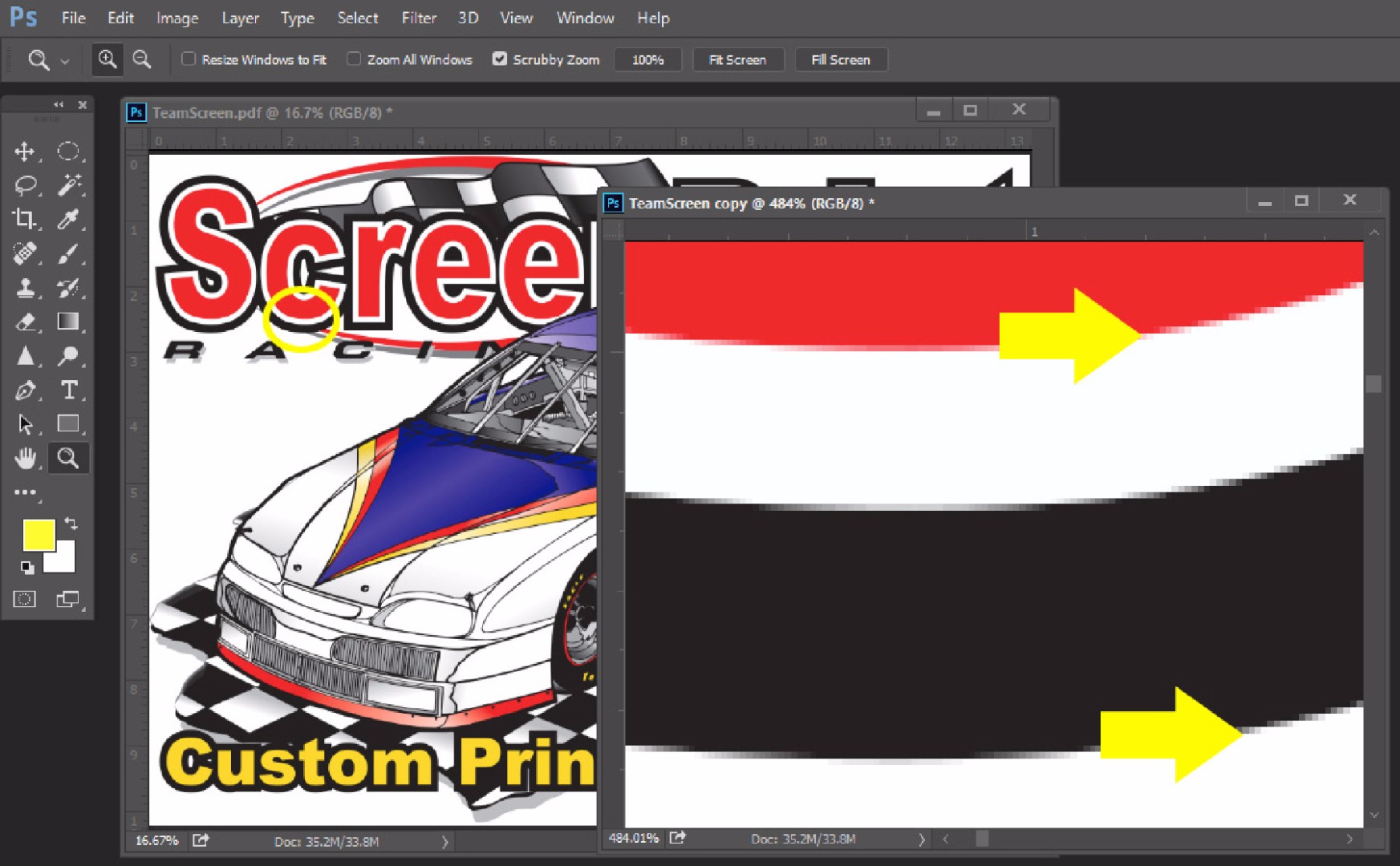
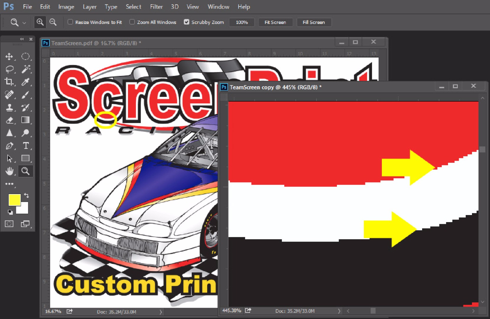
The default setting in this window is 72 dpi, with Anti-Aliasing checked. (See Figure 1.) You MUST change the resolution to 300 dpi and uncheck Anti-Aliasing. Figure 2 shows a close-up of the image in Photoshop with Anti-Aliasing checked. Figure 3 shows the same image with it off and at 300 dpi.

Figure 1: This is the default setting when you save a vector image in Photoshop.
OK, so why the fuss? Wouldn’t the image be better with softer edges rather than sharp jaggies from making it into pixels? It all sounds good on paper – and that is the point – if you are printing to paper, DTG, decals, wide-format posters, or sublimation, it will soften and blend the edges a little – especially on large-format posters. It’s ONLY when you’re trying to color separate an image that it makes any difference and where the softness really gets in the way of a clean set of separations.
Notice in Figure 2 how there is a variety of lighter colors around the edges. When you color separate this in Photoshop, these colors end up on separations as glows or halos. You have to erase these, and it takes time. Figure 3 shows the same image without Anti-Aliasing. Notice how clean and sharp it is. Yes, it’s a little jagged, but we’re zoomed in very close, and if you’re a vector snob, you need to get over it. These jaggies at 300 dpi will never show up on the shirt.

Figure 2: A close-up of the image when Anti-Aliasing is checked. Note the blurred edges.

Figure 3: A close-up with Anti-Aliasing off and at 300 dpi. The colors are much sharper, and the jagged edges will never show up once the T-shirt is printed.
Gray is the real problem color to separate in an image because if Anti-Aliasing is turned on, a lot of the smaller “softening” pixels are gray. I spend more time cleaning up gray separations than any, and in doing color separations, it’s all about time – time that your customer never pays for.
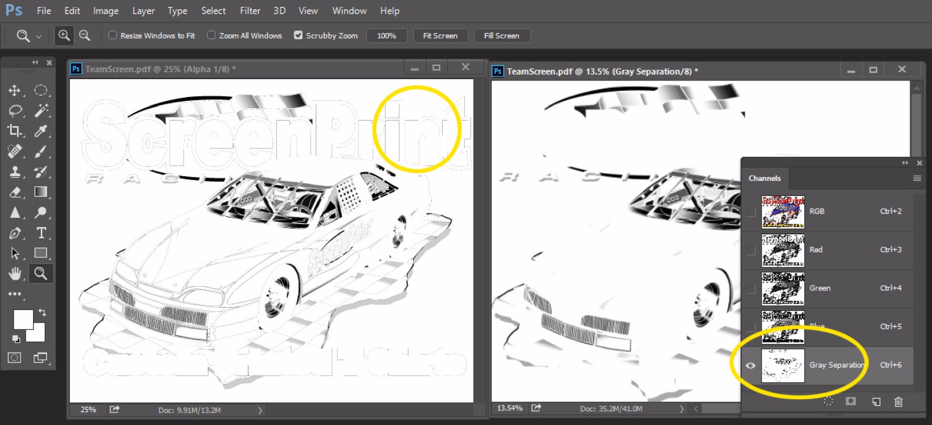
In Photoshop, typical separations are done using the Color Range tool to pull a color and make it into a channel. This is called a channel separation, and it’s how most high-end separations are done. The left image in Figure 4 shows a channel separation of the gray from the file with Anti-Aliasing turned on. The right image is of a gray channel separation with Anti-Aliasing turned off. It’s a HUGE difference. If I was doing this job, I would have to erase all the glows and light edges from the image on the left.

Figure 4: At left is a gray channel separation with Anti-Aliasing on. At right is the same channel separation with Anti-Aliasing turned off.
With two simple mouse clicks – turning off Anti-Aliasing and changing 72 dpi to 300 dpi – life is easier for the color separator.
I often get Photoshop files to separate where the customer or artist has tried to do me a favor by bringing their file into Photoshop from Illustrator or Corel. However, 95% of the time, they leave Anti-Aliasing on and the resolution at 72 dpi. I always have to go back and ask, “Do you have this as a vector file? I want to control how it is brought into Photoshop.”
***
Scott Fresener has been in the industry since 1970 and is the co-author of How To Print T-shirts For Fun And Profit. He created two automated separation programs, T-Seps and FastFilms, and is considered a pioneer in the direct-to-garment printing segment. Fresener is the director of T-Biz Network and is a popular speaker at trade shows. Fresener is also past Chairman of the Academy of Screen Printing Technology and was on the Board of Directors of SGIA. He runs the website www.T-BizNetwork.com. Reach him at scott@tbiznetwork.com.
