Your artwork dilemma: A customer wants a distressed look added to the vector artwork or photos she supplied.
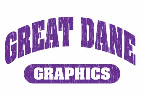
Solve This Dilemma: Dane Clement, president of Great Dane Graphics, takes the mystery out of creating cool, distressed art. With these easy-to-follow steps, you can transform vector art or photographs into a custom distressed look for use on promotional products, signs and apparel.
Keep the end result in mind – but be flexible and begin at the beginning.
1. Choose a photo with texture. Clement chose tree bark. Consider using cracked paint chips, concrete, carpet, almost anything with a heavy texture that can be manipulated and transformed to create a distressed overlay for your artwork.
2. Convert it to grayscale. Using Adobe Photoshop, go to the Image Menu. Select mode, then grayscale, and click on “Discard Color Information.”
3. Adjust the curves. Locate the curves window within the channels palette. Move the input and output anchor points together (toward each other). Your diagonal line should be almost vertical, and your image will become contrasted. Control the amount of texture by moving this and stop when you have the desired effect.
4. Make it transparent. With the channels palette open, hold down the Command key (Mac users) or Control key (PC users) and click on image thumbnail; this selects the information on the channel. Then invert the selection. Create a new layer, and select black as the foreground color. Fill the selection (use Option Delete on Mac, Alt Backspace on PC). Delete the background layer. Save the file as a TIFF, and be sure to select layers. You should also save the transparency in TIFF options. A pop-up will warn you that including layers will increase the file size. Just click “OK.”
5. Use the texture as an overlay. Open the artwork for distressing in the program of your choice. Create a spot color, something that will not print, such as a spot white or hot pink, anything that is not used in the design. Drag the color from your swatches palette and drop it over the TIFF.
TIP:
“In my example of the tree, I squeezed the TIFF to tighten up the texture and I duplicated it three times to get the look I wanted,” says Dane Clement of Great Dane Graphics.