Commentary April 04, 2022
How the Promo Products World Brought Harry Potter to Life
A new museum exhibit celebrating the famed series is also a showcase of the power of apparel and hard-goods decoration.
Back in 2018, it was announced that 500 million Harry Potter books had been sold, which means there are hundreds of millions of people in the world who have read the tale of the now-famous boy wizard. And I can freely admit I’m not one of them.
Now, don’t mistake me; I’m not a complete muggle. I’ve seen the movies. I’m familiar with characters like Sirius Black and Tom Riddle. I can name all four houses of Hogwarts (10 points to Ravenclaw).
But ask me to tell the difference between a Dementor and a Death Eater, or how many names Dumbledore has (it’s five, I’m told), and I’ll fail to conjure up an answer.
That’s not an issue for the rest of my Harry Potter-obsessed household. My wife rereads the books and rewatches the movies with alarming frequency. My 9-year-old daughter has Harry, Hermione and Ron plastered on her bedroom walls. For my 6-year-old, it’s not a matter of if she’ll read the books, but when.
So, when we discovered that Philadelphia’s Franklin Institute had a new signature Harry Potter exhibition, my family’s eagerness to attend was matched only by Ron’s infatuation with chocolate frogs.
For Potterheads, it’s an absolute delight – full of series lore and hands-on activities like summoning Patronuses and pulling mandrakes. It’s also an unabashed celebration of the movies, as the exhibit is filled with outfits and props used in the film, along with set pieces like Hagrid’s oversized furniture and Dolores Umbridge’s pink-strewn office.
Seeing the outfits worn by the Triwizard cup competitors or the signature wands of all the main characters was interesting on its own. But what surprised me the most on these Hallow-ed items was the use of decoration – the signature spell of the promotional products world. Seeing them up close, the embroidery, etchings, transfers and more leapt off these pieces in a way that wasn’t possible even if you watched the films on the big screen.
Not only did I walk away from the exhibit with a happy family and an empty wallet (damn that gift shop), but also with a deep appreciation for how the promo industry played such a pivotal role in creating the signature series of our era.
Here’s a look at the Harry Potter promotional products from the exhibit and gift shop, and how decoration brought them to life.
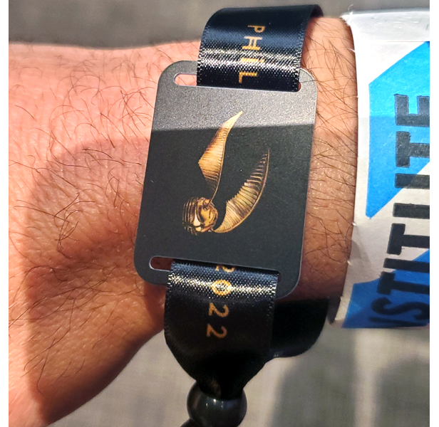
This was cool. At the start of the exhibit, you register your name and house, and then link it to this smart wristband. Then at select activities in the exhibit, you scan your wristband to earn points for your house. Best yet, you get to keep the wristband as a souvenir.
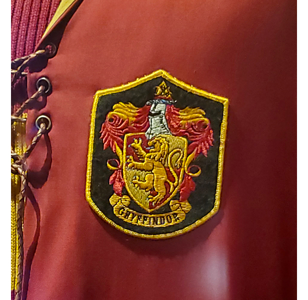
Patches have been a super-trendy option in promo for a few years now. In the films they play an even more invaluable role: identifying each wizard’s house. They’re all over the costumes from the films – each patch lovingly designed and full of detail.
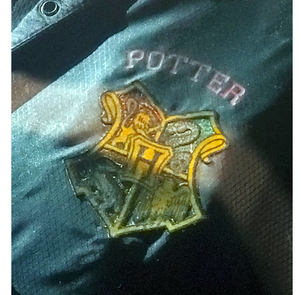
More patches. And since these are uniforms worn by the competitors in the Triwizard cup, they’re personalized with the wizard’s name using heat transfer. I just can imagine some wizard toiling away in the bowels of Hogwarts over a heat press. Otherwise, kudos to the distributor who landed Hogwarts as a plum account.
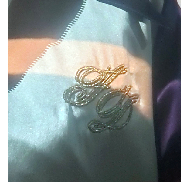
Fleur Delacour’s Triwizard garb really stands out thanks to the sparkly embroidery used for her monogramed initials.
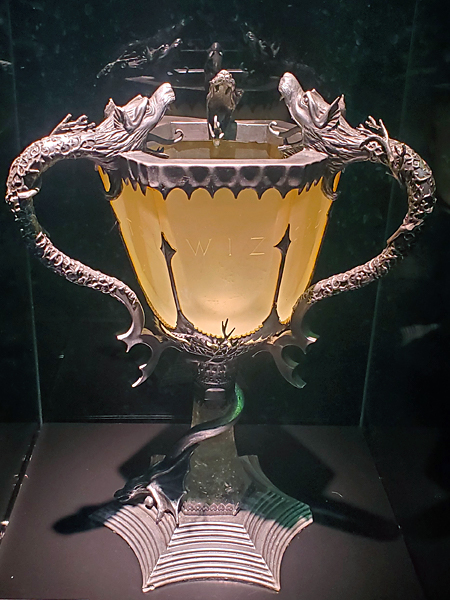
I bet your trophy game can use an upgrade – and perhaps you can use the Triwizard Cup as inspiration. Look closely and you can see the etched wording in the panels, which is a very cool touch.
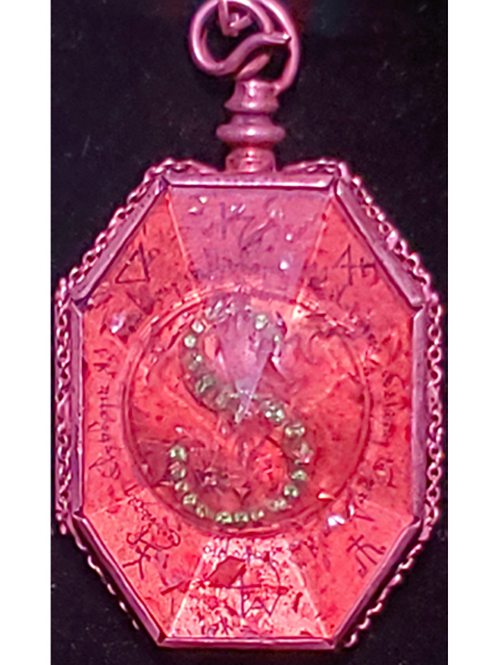
Crystals – not just for bedazzling. They add an opulent element here to this Slytherin locket.

The famed Elder Wand. The small details on this, and really all the items shown from the movies, are super-impressive.
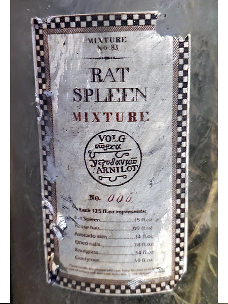
It must have been fun to print these labels. Maybe not as fun to painstakingly distress them. Again, no detail goes overlooked on a movie set.
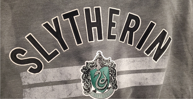
Lots to look at in the gift shop. I like the use of appliqué here with a slightly more modern aesthetic.
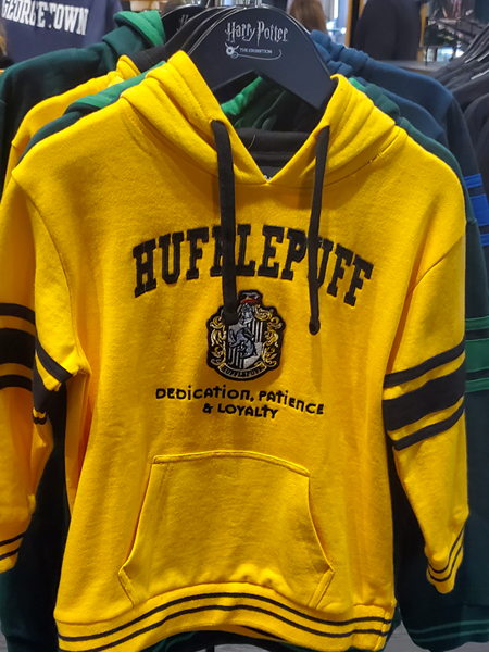
More appliqué, along with patches and embroidery for a decidedly retro school vibe.
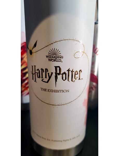
Drinkware is mandatory these days. The gold inlay is great, but look closely and you can see the little gold sparkles shooting off. It’s a really nice detail.
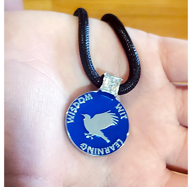
My daughter’s prized get from the gift shop: a Ravenclaw necklace. This is the back of it. I love the bold color and clean design.
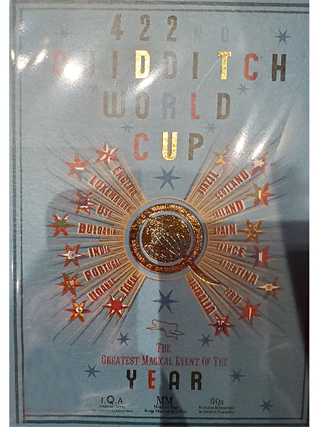
This postcard must have been fun to design. One of the cool aspects of the Potter universe is that it feels practically out of time. From a design sensibility, it creates this unique melding of the old and the new, as well as fantasy and reality. By this point, the Harry Potter world is now part of a vast merchandising empire. But it was really cool to see how the fundamental tools of our industry played such a huge part in making a fictional universe feel completely realized. That’s a bit of wizardry that anyone in the promo world can take immense pride in.

