With Counselor’s 70th anniversary this year in the forefront of our minds, we traveled back almost half a century to explore the evolution of data presentation since the magazine’s first State of the Industry report in 1977. From black-and-white to color and from hand-drawn cartoons to computer renderings, both the look of our exclusive statistics and the information relayed has certainly morphed. Here’s how our charts have changed through the years.
1970s
The first SOI data charts, starting in ’77, look a lot like this one shown on the left: grainy and generally straightforward. Though this first one shown is larger, many were rather small. Others were convoluted in layout, packing huge amounts of information in tiny spaces.
The visualizations from a year later in ’78 (shown right) struck a different tone, with the use of cartoon hand-drawings that provided an extra touch of creativity.
Because computer capabilities had only recently been embraced in the workplace, the mere concept of using data and charts at all was still new, plus the number of programs available to create more complex charts was extremely limited.
1980s
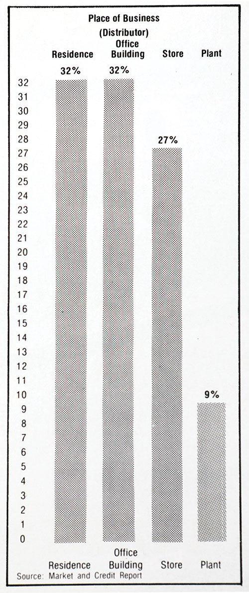
Overwhelmingly, the ’80s were characterized by a disappointing lack of data altogether. At least two years didn’t include any visualizations, while other years only presented dense data tables like you see in Excel files. Gone were the cartoons from the previous decade, with one of the most ‘interesting’ visualizations being a simple pie chart (shown left).
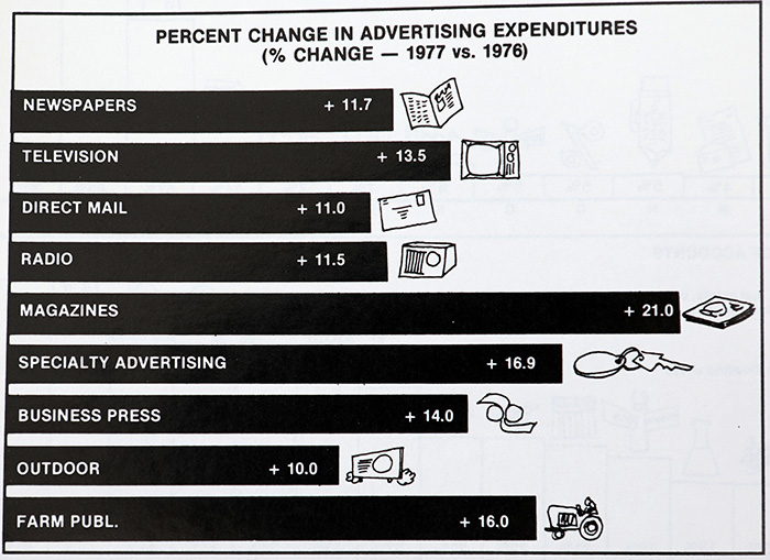
In print, sometimes you have to get a bit “creative” to fit all the information you want. It seems that in 1984, our former editors they rather innovatively decided to slant the lines on a 45-degree angle (shown right).
1990s
To analyze data in the ’90s, Joe Haley, ASI’s product editor and education director, states that the Counselor writers had to put in overtime in order to enter into their computers the information from the SOI paper surveys. Programs like Harvard Graphics in the ’80s and ’90s were used to assist with data visualization and design capabilities prior to the adaptation of Microsoft Suite, says Nate Kucsma, senior executive director of research at ASI.
Starting in 1990, graphics in the magazine became more advanced, which can be attributed in part to the usage of color as well as drawings that echoed the approach in the late ’70s. This graph (upper right) showcases the use of space, color and font size in a fun and engaging way.
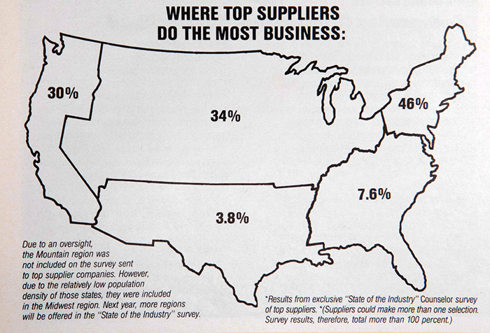
Another example (lower right) of a more advanced visualization includes the usage of maps, such as this one depicting the top suppliers’ business activities throughout the United States. Designs such as this enabled more effective regional comparisons, moving beyond merely listing data points in tables.
2000s
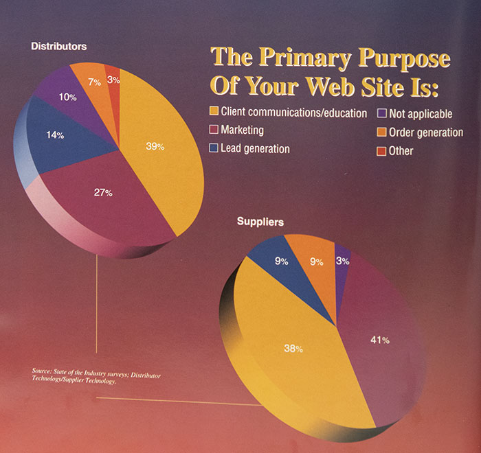
With the growing computer capabilities of the late 1990s and early 2000s came data visualizations that demonstrated enthusiasm for bolder colors and larger graphics. Three-dimensional pie charts and bar graphs abounded throughout the SOIs, frequently featuring effects like ombre shading that suggested the graphs were most likely produced in Microsoft Office with most of the available stylistic settings turned on. This example (right) from the 2000 issue of SOI is a perfect example of the times (and also telling of the evolution of business, with less than 10% of both distributors and suppliers saying they were primarily using their websites for customer orders).
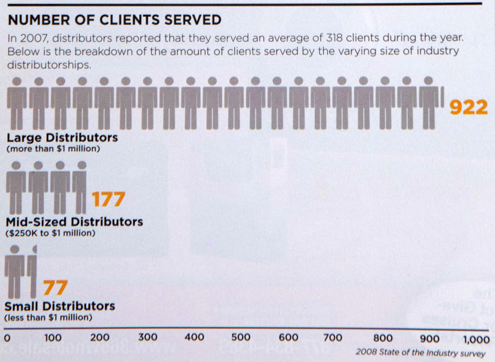
However, as the decade rolled on, visualizations began to appear much closer to what is used in the SOIs of today (which not surprisingly coincided with the magazine’s major redesign in ’05). Graphs became more complex as they were populated with illustrative elements beyond the basic shapes, like this visualization showing the average number of clients served by small, mid-sized and large distributors.
2010s
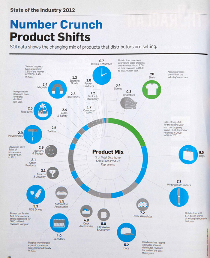
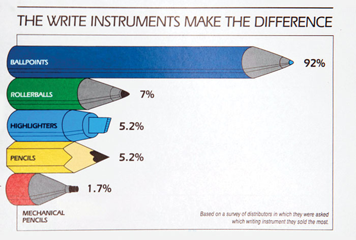
As the new century rolled on, renderings began to appear much closer to what’s used in the SOIs of today. Graphs became a bit more visually complex and took on a more prominent place in the design of the magazine, populated with illustrative elements and detailed breakdowns. A prime example is breakdown of product popularity from the ’12 SOI, which combines big picture data with illustrations.
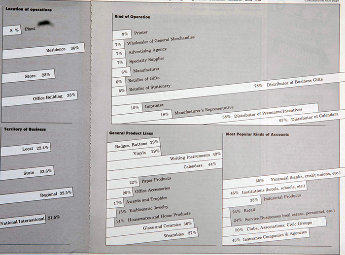
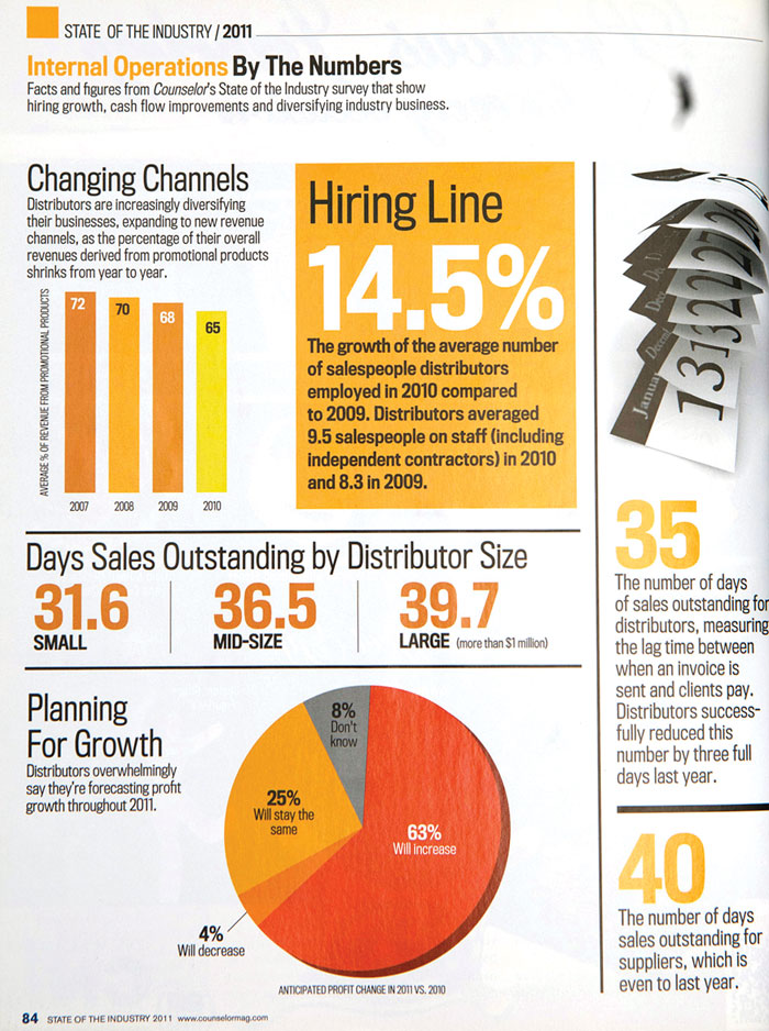
A single page – like this information from the 2011 issue about internal operations – could give one a widespread, clear overview of the industry at a quick glance, almost serving as a “story” in its own right, rather than just an accompaniment of the written words.
2020s
By the 2020s, data graphics in SOI had become more standardized, comparative and integrated into the magazine’s design. Building off the move toward infographics, many visualizations contained multiple years of comparison in a single chart, and often were grouped with other graphics.
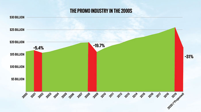
When there were single graphics, they were large, impactful and told an independent story – like this one from the 2020 SOI, which clearly reflected the challenges the industry faced during the start of the COVID-19 pandemic by highlighting other, similar recession periods. And as the example (below) from this year's State of the Industry shows, statistical visualization to help distributors and suppliers will continue to be a key focus of future issues of SOI.